A Practical Monte Carlo Simulation Example
Explore a hands-on Monte Carlo simulation example. Learn to forecast portfolio returns and visualize risk with a practical, step-by-step Python guide.

Think of a Monte Carlo simulation example as a sophisticated way of rolling dice. If you wanted to know the odds of rolling a seven, you could roll a pair of dice thousands of times and record the results. That’s the basic idea, but applied to far more complex problems like forecasting your investment portfolio's future value.
It's a powerful method for seeing a whole spectrum of possible outcomes, not just one rigid prediction.
How Monte Carlo Simulation Works in Finance

Before we jump into the code, it’s crucial to get a feel for what a Monte Carlo simulation actually accomplishes in the financial world. At its core, it’s a tool for navigating uncertainty.
A traditional financial model might spit out a single number: "Your portfolio is projected to grow by 8% next year." That sounds precise, but it completely ignores the enormous range of possibilities and risks involved.
After all, the market is anything but predictable.
A Monte Carlo simulation confronts this reality head-on by embracing randomness. Instead of generating one forecast, it runs thousands sometimes tens of thousands of different scenarios. Each simulation paints a unique, potential future for your investments, grounded in historical data but injected with a calculated dose of chance.
The Power of Random Walks
Each simulation is essentially a "random walk." It takes your portfolio's historical average returns and volatility as a baseline. Then, for every single day in your forecast period, it introduces a random variable to nudge the portfolio's value up or down.
Repeat this thousands of times, and you build a massive library of possible outcomes. Some simulations will show fantastic growth, while others might map out scary downturns. This collection of results is what forms a probability distribution.
The real magic isn't in trying to pinpoint one 'correct' future. It's in understanding the entire landscape of what could happen. This helps answer the questions that really matter, like, "What's the probability my portfolio loses more than 20% of its value over the next five years?"
To make these concepts a bit more concrete, here’s a quick breakdown of the moving parts in our portfolio simulation.
Key Concepts in a Monte Carlo Simulation
Each of these components works together to create a rich, probabilistic view of your portfolio's potential future, moving far beyond a simple, single-line projection.
From Theory to Practical Application
This technique isn't just academic; it's a workhorse for financial professionals. Analysts use it to model stock prices, and risk managers rely on it to stress-test investment strategies. For example, a firm might run thousands of iterations to estimate a stock's likely price range, giving investors a much clearer picture of both risk and reward. As detailed in this IBM analysis, major companies use these simulations to build far more resilient financial plans.
Ultimately, getting a solid grasp of what is Monte Carlo simulation is the essential first step. It’s about transforming abstract risks into tangible probabilities, giving you a much more honest picture of your financial future. This foundation is exactly what we need before diving in and building our own Python model.
Preparing Your Python Environment and Data

Every powerful monte carlo simulation example starts with a solid foundation. Before we can spin up thousands of potential portfolio futures, we need to get our workshop set up with the right tools and gather our raw materials. For us, that means prepping a Python environment and grabbing some high-quality historical data.
First things first, let's make sure you have the necessary Python libraries installed. These are the workhorses that will do the heavy lifting, from grabbing data to running the complex math. If you don’t have them yet, you can quickly install them using pip, Python's built-in package installer.
Here’s a quick rundown of the essential libraries and the roles they play:
- Pandas: This is our go-to for organizing and cleaning financial data. We'll lean on it to manage our time-series info, like daily stock prices.
- NumPy: The core of numerical computing in Python. It gives us the mathematical firepower we need to calculate returns and handle the simulation's array operations.
- Matplotlib: A picture is worth a thousand data points, right? Matplotlib will be our visualization engine, turning simulation results into charts we can actually understand.
- yfinance: A super handy library that gives us direct access to historical market data from Yahoo! Finance. It saves us the headache of manually downloading CSV files.
Acquiring and Structuring Your Data
With our environment ready, the next move is to fetch the data that will fuel our simulation. We need historical price data to get a sense of how our chosen assets have behaved in the past. For this walkthrough, let's build a simple, tech-focused portfolio with Apple (AAPL), Microsoft (MSFT), and Google (GOOG).
Using the yfinance library, we can download years of daily adjusted closing prices for these tickers in just a few lines of code. It's really important to grab enough history I usually find three to five years is a good starting point. This ensures you capture different market cycles and can build a reliable statistical baseline.
Once we have the raw prices, they're not quite ready for the simulation. We need to process this data to pull out two absolutely critical inputs.
The entire simulation hinges on two key statistical measures derived from historical prices: the average daily returns and the covariance matrix. The first tells us the general "drift" of the assets, while the second describes how they tend to move together.
First, we'll convert the daily prices into daily percentage returns. This step standardizes the data and gives us a clear look at the day-to-day volatility of each stock. From there, we can calculate the mean (average) return for each one.
Next, and this is the most crucial part, we calculate the covariance matrix of those daily returns. This matrix is the real heart of a portfolio simulation. It doesn't just quantify the individual volatility of each stock; it also captures the correlation between them. For example, it mathematically describes the tendency for AAPL and MSFT to move in the same direction on a given day.
With these two inputs ready the mean returns and the covariance matrix we finally have everything we need to build the simulation engine.
Coding the Monte Carlo Simulation Engine

Alright, this is where the magic happens. We're about to turn all that financial theory into working Python code. The mean returns and covariance matrix we just prepared are the fuel for our forecasting engine, ready to simulate thousands of possible futures for our portfolio.
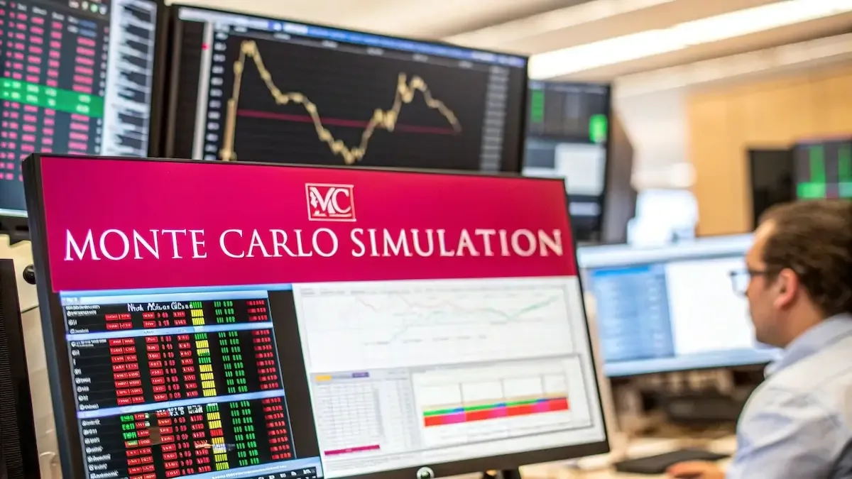
Think of it like the image above. We're essentially throwing thousands of random darts at a board to figure out the most likely outcomes. Each dart is one possible future path for our portfolio, and we're about to code the machine that throws them.
We'll assemble the core logic step-by-step, starting with the main parameters that will define the scope of our simulation.
Setting Up Your Simulation Parameters
Before our code can start running scenarios, we need to give it some instructions. Think of these as the main dials on our forecasting machine, which we'll place right at the top of our script so they're easy to tweak later on.
We need to define three key parameters:
- Number of simulations: This is the total number of "random walks" or future paths we want to generate. A great starting point is 10,000 simulations. It’s a big enough number to create a reliable distribution of potential outcomes without bogging down your computer.
- Time horizon: This is how far into the future we’re looking. For a standard one-year forecast, we'll use 252 trading days.
- Initial capital: This one's simple it's the starting value of our portfolio. For this run, we'll use an initial investment of $100,000.
Once these variables are locked in, we can prepare a place to store our results. A simple NumPy array is perfect for holding the final portfolio value from each of our 10,000 simulations. Using NumPy here makes the final number-crunching much faster.
Building the Core Simulation Loop
The real heart of our Monte Carlo simulation example is a for loop that runs once for every simulation 10,000 times in our case. But inside that main loop, we'll nest a second one. This inner loop is what projects the portfolio's value day by day across our 252-day horizon.
On each day, the code performs one critical calculation: it generates a single step in our portfolio's "random walk." This isn't just a generic random number. It's a correlated random value pulled from a multivariate normal distribution.
This is the most important part of the simulation. By using the covariance matrix from the previous step, the random daily returns for AAPL, MSFT, and GOOG will move in ways that mirror their real-world historical relationships. It’s what makes the simulation feel realistic instead of just treating each stock as an island.
The code then applies this calculated daily return to the portfolio's value from the day before. It repeats this for all 252 days, tracing out one complete potential future. When that path is finished, its final value is saved, and the simulation starts over for the next run.
This methodical, data-driven approach is a staple in quantitative finance. If you're interested in similar techniques, our guide on how to backtest trading strategies provides some great complementary insights into model validation.
Visualizing and Interpreting Your Results

Running 10,000 simulations is a pretty cool feat of computation, but the raw numbers themselves are just noise. The real magic of any Monte Carlo simulation example happens when we turn that mountain of data into something we can actually use. This is where a bit of data visualization comes in, transforming all those abstract possibilities into a clear picture of what your portfolio's future might hold.
Using a library like Matplotlib, we can bring the results to life in a snap. A great first step is just to plot a small sample say, the first 100 simulated portfolio paths. This simple line chart is surprisingly powerful. It instantly shows the sheer range of potential outcomes, with some paths soaring while others dip, giving you a gut feel for the market's randomness.
But the single most important visual you'll generate is a histogram showing the final portfolio values from all 10,000 simulations.
Unpacking the Distribution of Outcomes
This histogram is really the heart of the whole analysis. It groups all the final portfolio values into different buckets, or "bins," and shows you how frequently each outcome occurred. The shape of this chart tells a story all on its own, revealing both the most likely results and the full spread of possibilities.
You'll almost certainly see something that looks like a bell-shaped curve. This is the probability distribution of your one-year forecast. The peak of that curve represents the most likely outcome, while the tails stretching out to the sides show the less probable, more extreme scenarios both on the upside and the downside.
With this one chart, you can move past a simple average and start answering the questions that really matter for financial planning:
- What does a realistic best-case scenario look like? The right tail of the distribution shows you the high-end outcomes.
- What's the probability of a major loss? The left tail highlights the potential for downturns, helping you put a number on your downside risk.
- How confident should I be in this forecast? The spread of the curve is a proxy for uncertainty. A narrow, steep curve suggests more predictable results, while a wide, flat one signals a lot more volatility.
If you want to go deeper on this, you can check out our detailed guide on calculating portfolio risk, which breaks down these statistical concepts even further.
Calculating Key Statistical Metrics
Visuals are powerful, but we need concrete numbers to ground our decisions. By analyzing the array of 10,000 final portfolio values, we can calculate specific metrics that put firm boundaries around our forecast.
The most practical way to do this is to find the 5th and 95th percentile values.
These two percentiles create a 90% confidence interval. The 5th percentile tells you the value that 95% of your simulations beat. The 95th percentile shows the value that only the top 5% of simulations managed to surpass. Together, they give you a statistically sound range for your portfolio's expected value in one year.
For instance, let's say your 5th percentile comes out to $85,000 and your 95th percentile is $140,000. You can now say with 90% confidence that your initial $100,000 portfolio will likely end up somewhere in that range. This is a much more honest and useful forecast than just picking a single number. This is one of the core ideas behind the broader uses of the Monte Carlo method using simulations to approximate complex distributions, a technique even used in fields like Bayesian inference.
Common Pitfalls and Model Improvements
While our basic Monte Carlo simulation example gives us a powerful lens into potential portfolio futures, it's crucial we don't get ahead of ourselves. The model we've built operates on one massive assumption: that the statistical properties of the past average returns, volatility, and correlations will hold true for the future.
This is a fine starting point, but real-world markets are rarely so well-behaved.
Ignoring this can lead to a false sense of security. Historical data doesn't account for black swan events, shifts in economic regimes, or a company's business model getting turned upside down. Relying solely on past performance is like driving a car by only looking in the rearview mirror. It tells you where you've been, not what's coming around the bend.
Addressing Non-Normal Returns
One of the most common traps is assuming that asset returns follow a perfect normal distribution a clean bell curve. The reality is that financial markets often have "fat tails." This just means that extreme events, both good and bad, happen way more often than a normal distribution would have you believe.
The 2008 financial crisis is the poster child for a fat-tail event.
To build a more robust model, you can explore a few alternatives that better capture this messy reality:
- Student's t-distribution: This distribution naturally has heavier tails than the normal one. Using it allows your simulation to account for a higher probability of those wild, outlier days.
- Bootstrapping: This is a neat trick. Instead of generating random numbers from a theoretical distribution, you just randomly sample directly from the historical daily returns you already have. This method preserves the original data's unique quirks, including any skewness or fat tails.
Accounting for Changing Volatility
Another big limitation is assuming volatility is constant. Our model uses a single volatility figure calculated from years of data, but we all know markets move in cycles. Periods of calm can be shattered by a sudden spike in turbulence.
A more advanced approach involves using models that account for "volatility clustering" the tendency we see for volatile days to be followed by more volatile days. This creates a much more dynamic and realistic simulation of how markets actually behave.
Techniques like GARCH (Generalized Autoregressive Conditional Heteroskedasticity) are designed to model this changing volatility over time. Weaving a GARCH model into your simulation allows the projected volatility to evolve, giving you a more nuanced risk assessment that reflects the market's true character.
These refinements can seem complex, but they're what transform a simple academic example into a sophisticated forecasting tool that you can actually trust.
Here’s a quick rundown of how these refinements stack up, helping you decide where to focus your efforts as you get more comfortable with the basics.
Model Refinements Comparison
Starting with a simple model is great for understanding the mechanics. But as you can see, layering in these improvements is what gives your Monte Carlo simulation real-world credibility and makes it a far more reliable guide for your financial decisions.
Got Questions? Let's Talk Details.
Even after you've built a working model, a few practical questions always pop up. It's one thing to see the simulation run; it's another to trust its output for your own financial planning. Let's tackle the big ones I hear most often.
Probably the number one question is about the simulation count. Is 10,000 enough? Is more always better?
How Many Simulations Are Enough for a Reliable Result?
There’s no single magic number, but for most portfolios, 10,000 to 20,000 simulations is a great target.
The real goal here is convergence. You want to run enough simulations so that your key results like the final average portfolio value and the best/worst-case percentile outcomes stop changing significantly.
Here’s a practical way to check: run your simulation with 10,000 paths and write down the 5th and 95th percentile results. Then, run it again with 20,000. If those numbers barely budge, you’ve probably hit the sweet spot. Pushing it to 50,000 or 100,000 will just burn processing power without adding much insight.
Can I Use a Monte Carlo Simulation for Short-Term Trading?
Honestly, it’s the wrong tool for the job. Monte Carlo shines when you're doing long-term strategic planning think retirement forecasting over 20 or 30 years.
Short-term trading is a different beast entirely. It’s driven by catalysts that a simple random walk model just can't see, like:
- Breaking News: A surprise earnings report or a Fed announcement can throw historical patterns out the window in a heartbeat.
- Market Sentiment: Fear and greed play a massive role in day-to-day price swings.
- Technical Patterns: Day traders live and die by chart patterns that this model isn't designed to recognize.
This simulation is all about exploring the vast range of possibilities over a long horizon, not predicting whether a stock will go up or down next week.
A crucial thing to remember is that this model’s biggest weakness is its reliance on the past. We're making a huge assumption that historical returns, volatility, and correlations will hold up in the future. That’s a big 'if' in a market that's always changing.
It also assumes returns follow a neat bell curve. In reality, markets have "fat tails" extreme events happen more often than a perfect normal distribution would suggest.
Think of this simulation as a powerful tool for mapping the territory and understanding your risk exposure. It’s not a crystal ball for predicting the exact path your portfolio will take.
Ready to move beyond spreadsheets and apply these powerful forecasting methods to your own portfolio? PinkLion offers AI-powered scenario simulations, stress-testing, and asset forecasts to give you a clear, data-driven view of your financial future. Start for free and take control of your investments.